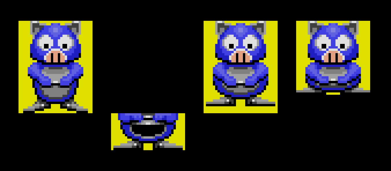
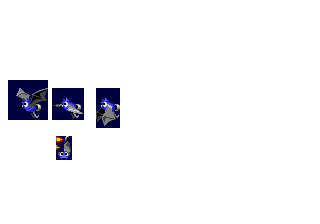
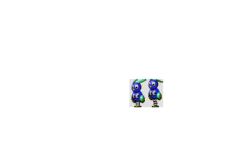
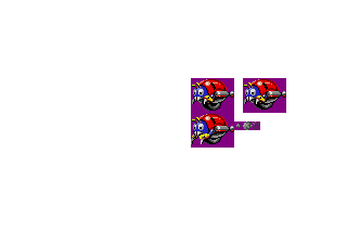
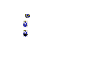
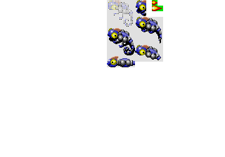
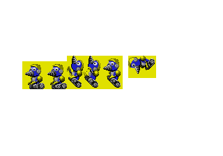
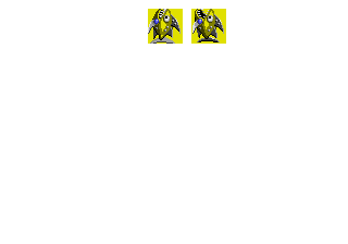
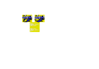
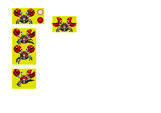
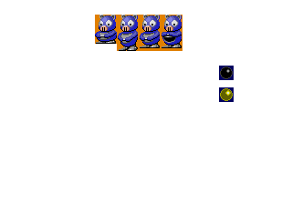
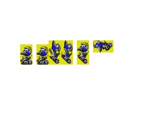
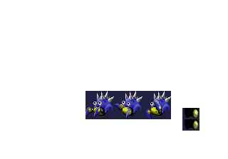
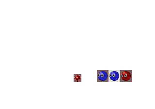
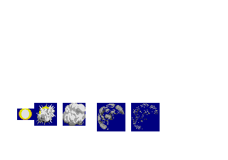
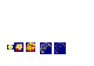
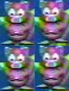
Graphics for the enemies (“badniks”) created by Yasushi Yamaguchi for Sonic The Hedgehog (Mega Drive). Found by Frank Cifaldi after dumping a floppy disk labeled “Yamaguchi’s Enemies”, which was given to Tom Payne during the development of Sonic 2.
Most of the file names are the Japanese names of the animal represented by each robot, with some exceptions which Tom very likely renamed back then.
The graphics format was cracked by Rich Whitehouse and these can be extracted from the original files, through its application Noesis.
Some observations
Regarding the colors used by these graphics, we have two palettes: One of them is Sonic’s “original palette” before it was modified for the final version of the game, which is used by the enemies which feature any red hues.
This same palette is used in other games such as Sonic CD (while Sonic travels in time and in the save file manager) and Sonic Eraser, while Sonic Crackers’ was based on it but with some colors modified to look more orange, so that they could also work with Tails.
The other palette used by these graphics is a variant that replaces the red tones with the yellow ones from the rings. It’s very unlikely that it was used in the game at any given time, since Sonic always needs some red tones for his shoes, and it would be a waste to occupy half of the space allocated to the colors in memory with two practically equal palettes.
Why use this palette if it’s not present in the game? It’s possible that they had already thought beforehand that the enemies would be able to make use of both the first palette (Sonic’s) and the second one, whose main tones would alternate between green and purple according to the level, thus being able to correctly show each enemy in three different color schemes (blue+red, green+yellow, purple+yellow). Due to this, at the time of designing them, they might have preferred to use the “blue+yellow” scheme, as “neutral” colors so that they wouldn’t favor any of the color schemes over another.
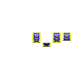
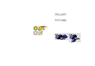
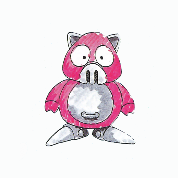
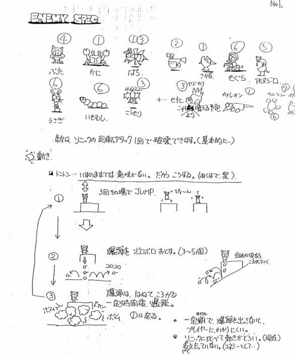
These graphics include Splats the rabbit and an alternative version of the “Ball Hog”, which faces the camera (as in the Japanese manual) and drops its bombs to the floor below as could be seen in Yasuhara’s original designs.
This is how both look using the second Marble Zone palette:
This design of the Ball Hog is practically identical to the one which could be seen in the first public demo of the game at the Winter CES 1991, although in this one it moved laterally taking small steps instead of jumping in place.
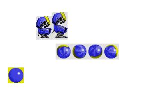
Returning to Burrobot, if you look closely, its graphics are not duplicated as it might seem to the naked eye, but one of the files is an older untweaked version, which uses more tiles than it should.
For optimization, in the newer revision, its head was moved a few pixels backwards (since its mappings would place it in its correct position when shown in game), in a way that several tiles (groups of 8×8 pixels) are left completely empty so that they can be removed to free memory space.
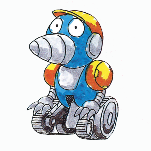
Interestingly, due to the blue+yellow color scheme discussed above, his helmet shows here a (more classic) yellow color which causes the enemy to look more like his Japanese manual illustration than his actual game graphics, in which he wears a red helmet.
Had they programmed it to use the second palette available in video memory rather than Sonic’s, its graphics would have featured a yellow helmet… but in a purple body.
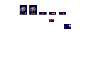
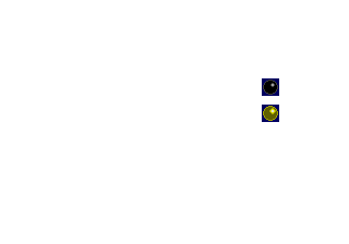
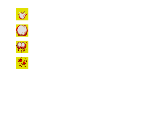
Finally, there are also a couple of water splashes which don’t appear in the final version:

