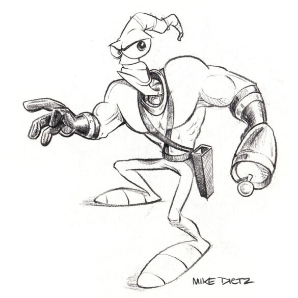
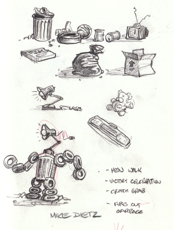
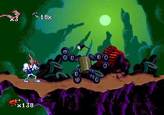
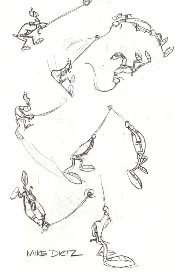
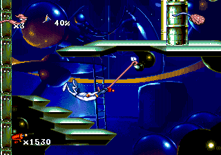
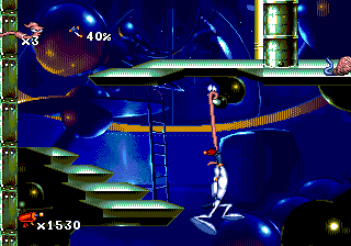
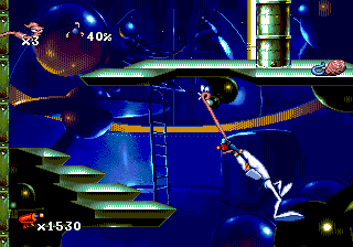
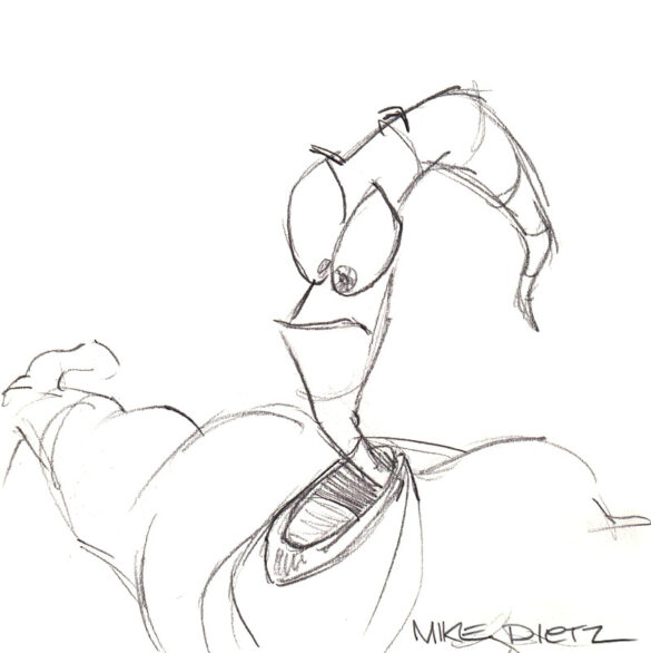
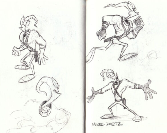
Development art created by Mike Dietz for Shiny Entertainment during the development of the first Earthworm Jim game.
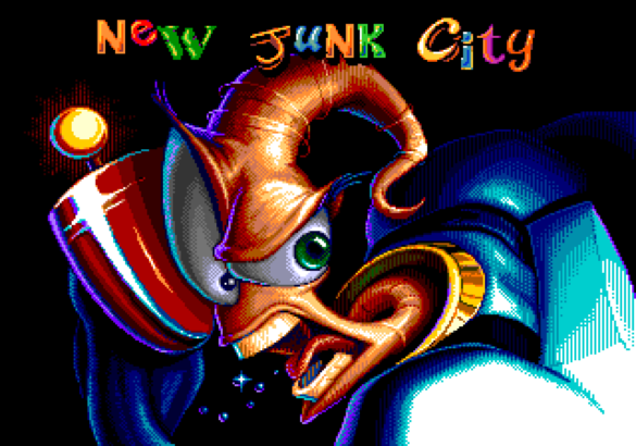
Title card
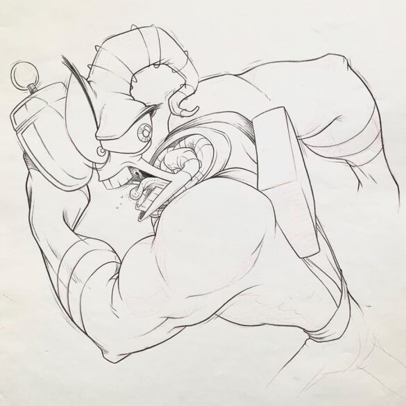
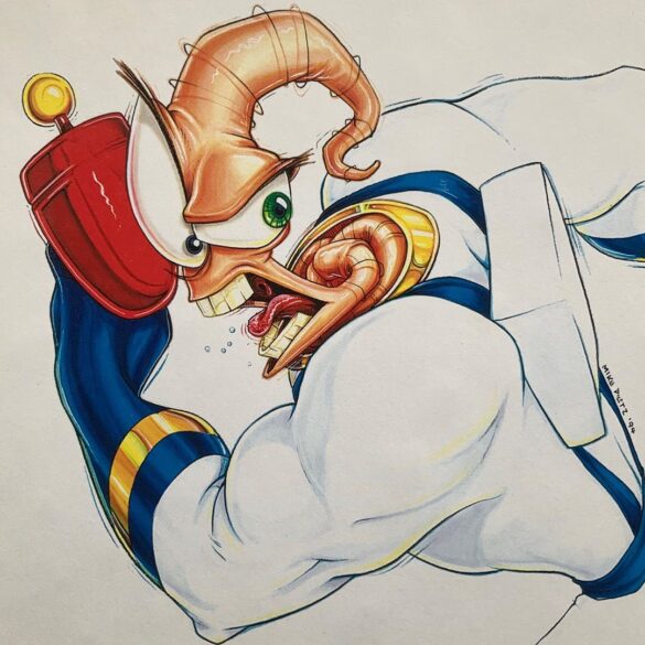
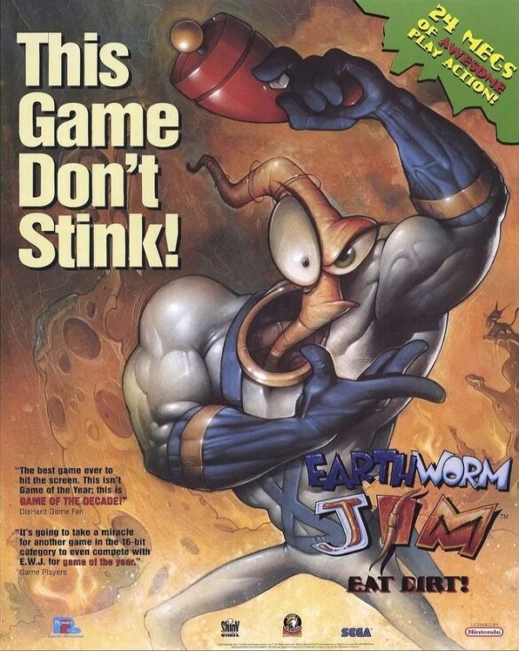
I came across this drawing for an old Earthworm Jim illustration I did back when we first released the game. It was for a magazine cover… I don’t recall which one. I was never a big fan of the gritty snarling EWJ, I always preferred the goofier side of him, but this is what the other guys wanted.
Back then I was shooting photostats of my drawings and painting them with Dr. Martin’s dyes. It was a slow process but I liked the vibrant colors I got from the dyes.Source: Mike Dietz
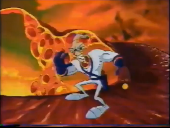
This illustration was used as the basis for the Title Cards in the game:
Advertising
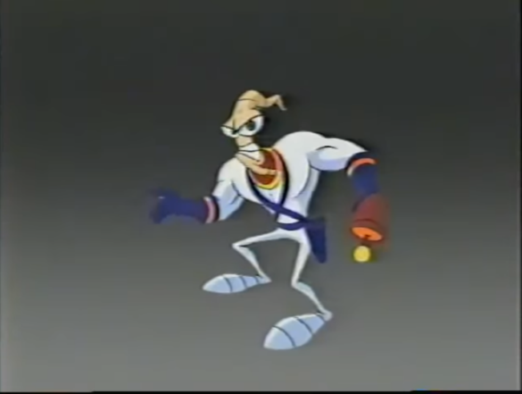
An old character layout I did for the Earthworm Jim TV commercial a looong time ago.
Source: Mike Dietz
Even though the cleaned up version of this specific frame didn’t make it to the commercial (which skipped the first frames), the full animation would end up appearing in a “making of Earthworm Jim” special.
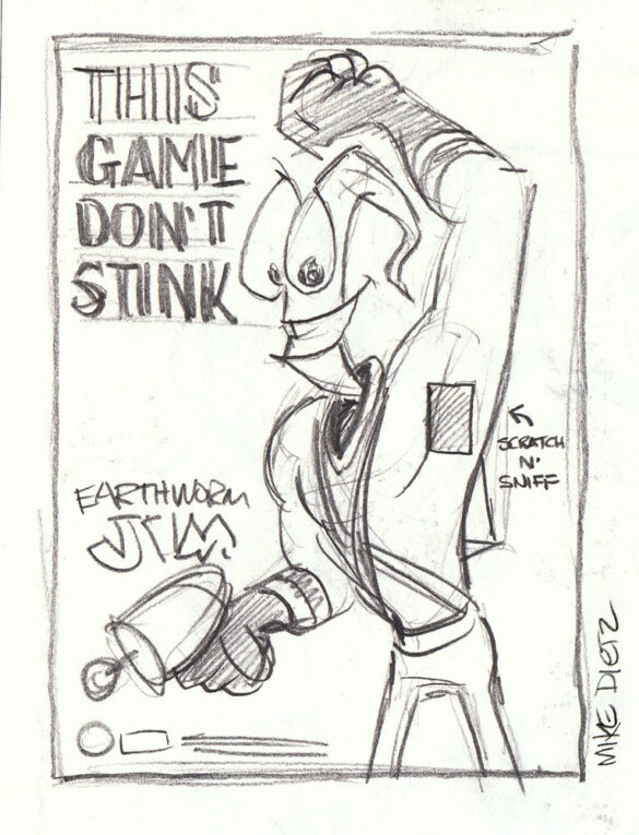
This concept would become a promotional poster, albeit without the suggested “scratch and sniff” bit.
Miscellaneous
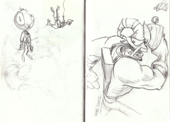
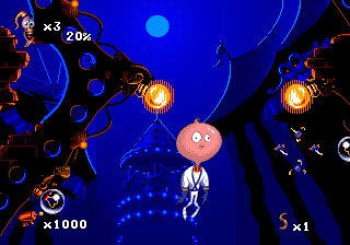
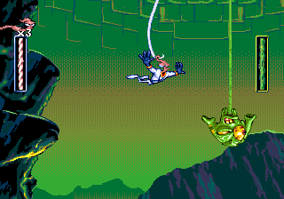
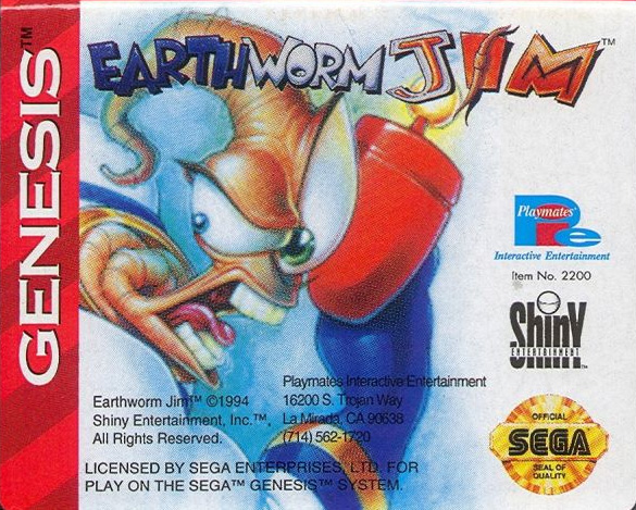
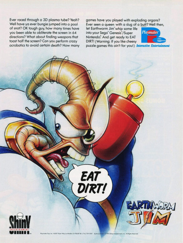
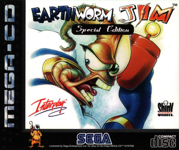
Sketches for an “inflated head” concept which wouldn’t be used until the sequel (left), the bungee gameplay (middle) and a “mirrored title card” sketch whose finished version by Michael Koelsch would become the cartridge art, a press ad and the Special Edition cover (or perhaps these were drawn afterwards, as a drawing exercise?).
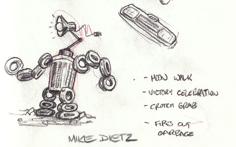
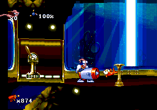
Concept for New Junk City’s mid-level boss.
Sketches for Jim’s whip-swinging animation.
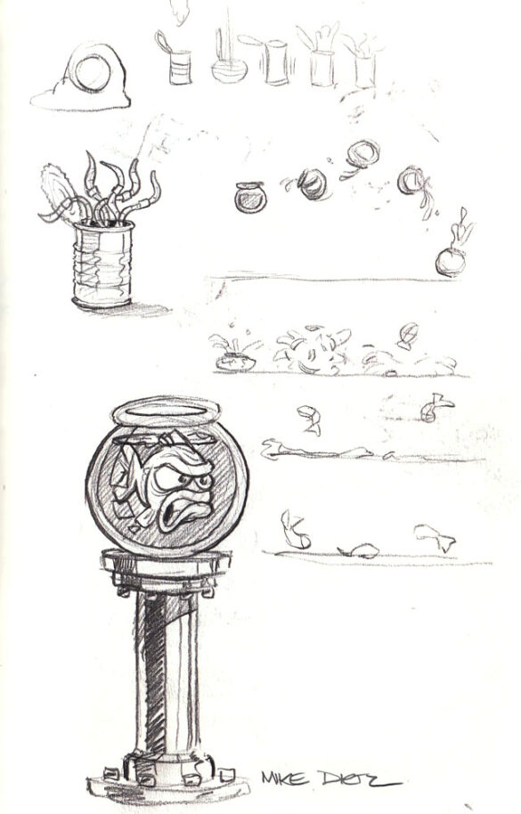
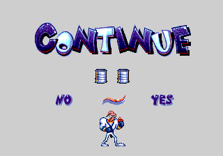
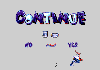
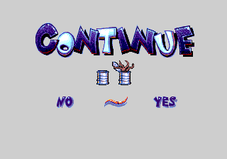
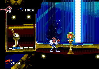
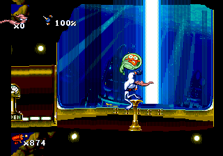
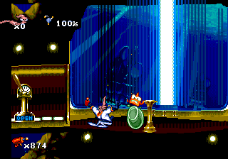
Concepts for the “can of worms” continue item and Bob the Goldfish’s demise.
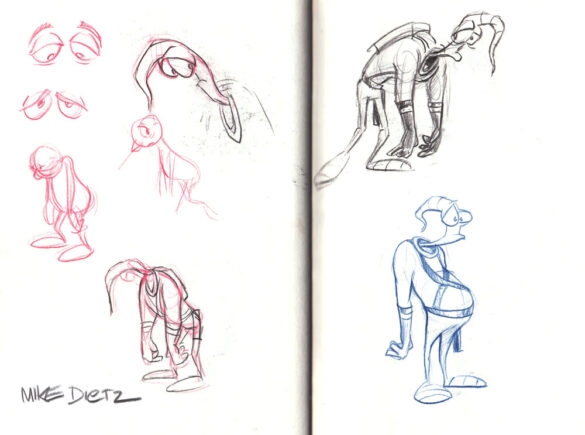
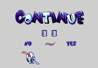
Sad Jim concept for the Continue screen, as well as a pot-bellied Jim for an unknown purpose.
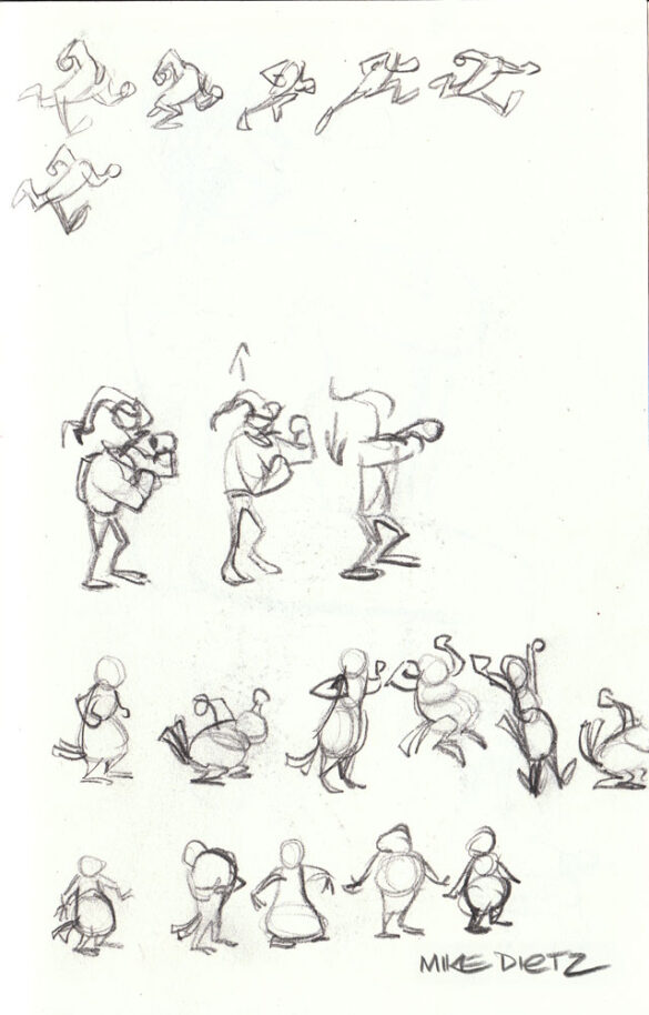
Some fighting Jim and jumping Psycrow sketches. (Were these made during the sequel’s development, instead?)
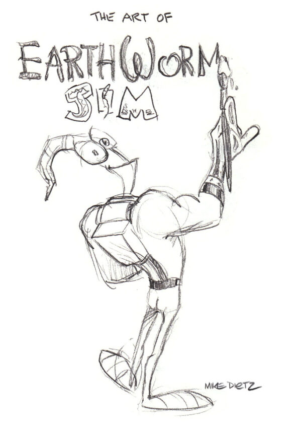
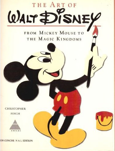
Various Jim sketches with unknown purposes, possibly made just for fun? The “art of” sketch is a parody of “The Art of Walt Disney” (no book titled “The art of Earthworm Jim” is known to have been in the works).

